IDENTITY SYSTEM
Brand
 V1 · JULY 2026
Black and white film photography, a Swiss grid, one serif in one weight, and a single red accent. Everything here is built from the same four anchors: the dither and grain shaders, the twelve column grid, Lennon with a system mono secondary, and the C arrow mark.
01 · LOGO
The C arrow
The mark is a C pierced by a forward arrow. When color applies to the logo it lands ONLY on the arrow, never on the C. The C is always ink on paper or paper on ink.
Ink C, red arrow. Default on paper.

All ink. When red would be one accent too many.

Paper C, red arrow. Default on ink or over imagery.

All paper. Quietest form, for dense photography.
- Clearspace on every side equals half the height of the mark
- Minimum size is 24px on screen and a quarter inch in print
- Never color the C, never outline, rotate, or dither the mark
- Over photography use the reversed or paper variant only
02 · COLOR
Paper, ink, one red
The palette is a print shop, not a screen. Warm cream paper, near black ink, three grays mixed from them, and one Swiss red that behaves like a rubber stamp: rare, small, and intentional. Red should never exceed roughly five percent of any composition.
#F2EFE9
Every background. Never pure white.
#141414
Type, rules, imagery shadows. Never pure black.
#5F5C55
Secondary text and captions.
#A09A8E
Tertiary labels, index numerals at rest.
#D9D4C9
Hairline rules and borders.
#E01E1E
The arrow, one dot, one card, active states.
03 · TYPOGRAPHY
Lennon and the machine
Three voices, each with one job. Lennon carries headlines, names, and numerals in its single Regular weight, so hierarchy comes from scale, never from boldness. It is a caps only face, which is why it never sets a paragraph: prose in it comes out shouting. Reading is carried by a neutral grotesque, the native body voice of a Swiss grid. The third voice is the system mono, set tiny, uppercase, and tracked wide, and it speaks like camera metadata on a contact sheet.
AaBbCcDdEeFfGg 0123456789
NIKON F3 HP · ILFORD HP5 PLUS 400 · FRAME 07A
Body copy is Instrument Sans at 17px with leading around 1.75. Every paragraph on the site is set in it, including the case studies. The rule is simple: if it is a sentence someone reads, it is the grotesque; if it is a label, it is the mono; if it is a title, it is Lennon.
04 · GRID
Twelve columns, hard crops
A strict twelve column grid with hairline gutters. Elements either sit inside their cells or get cut by them: oversized type and imagery crop at column edges on purpose. The one exception is the name, which always resizes to fit its cell rather than cropping.
- Twelve equal columns at every breakpoint
- Gutters clamp between 12 and 24px, margins between 16 and 48px
- Scale contrast is the hierarchy: pair a giant element with tiny metadata
- No hairline rules: space and scale separate the bands, not lines. The one exception is a dense list where the rules are what make it scannable
05 · TEXTURE
Dither and grain
Imagery is converted to pure ink and paper by an ordered 8x8 Bayer dither, anchored to the pixel grid like ink on newsprint. A monochrome film grain resamples at 14 frames per second over everything. Texture belongs to imagery and backgrounds, never to type or the logo.

- Live surfaces dither in the shader: 8x8 Bayer, cell size 1 to 3 CSS px
- Static and print exports use error diffusion dither, the close cousin
- Grain amplitude 4 to 6 percent, monochrome, strongest in midtones
- Dither strength is a dial: photographs may resolve from print texture
06 · IMAGERY
Contact sheet rules
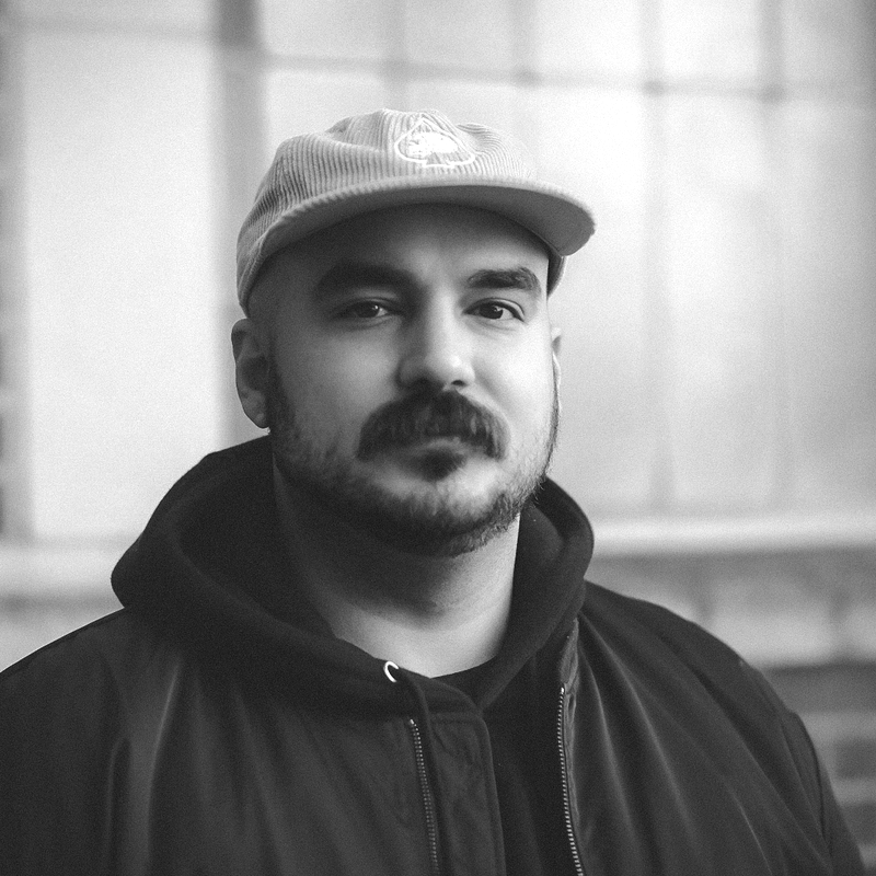
The page is black and white; the work is not. Hero imagery takes the full dither treatment. Case study covers rest in grayscale in the indexes and fade to their real color on hover, and the header image inside a case study runs full color, the same rule as the specimens: the work itself is where color lives. Every significant image earns a mono caption written like film metadata.

07 · MOTION
The zipper principle
Motion is assembly. Images arrive as dealt cards, resolve from scatter to portrait, and scrub with the scroll in both directions so the page feels like a fidget toy you can zip up and down. Easing is exponential and quick, staggering is per tile, and reduced motion always receives the finished, assembled state as a still.
08 · APPLICATIONS
The kit
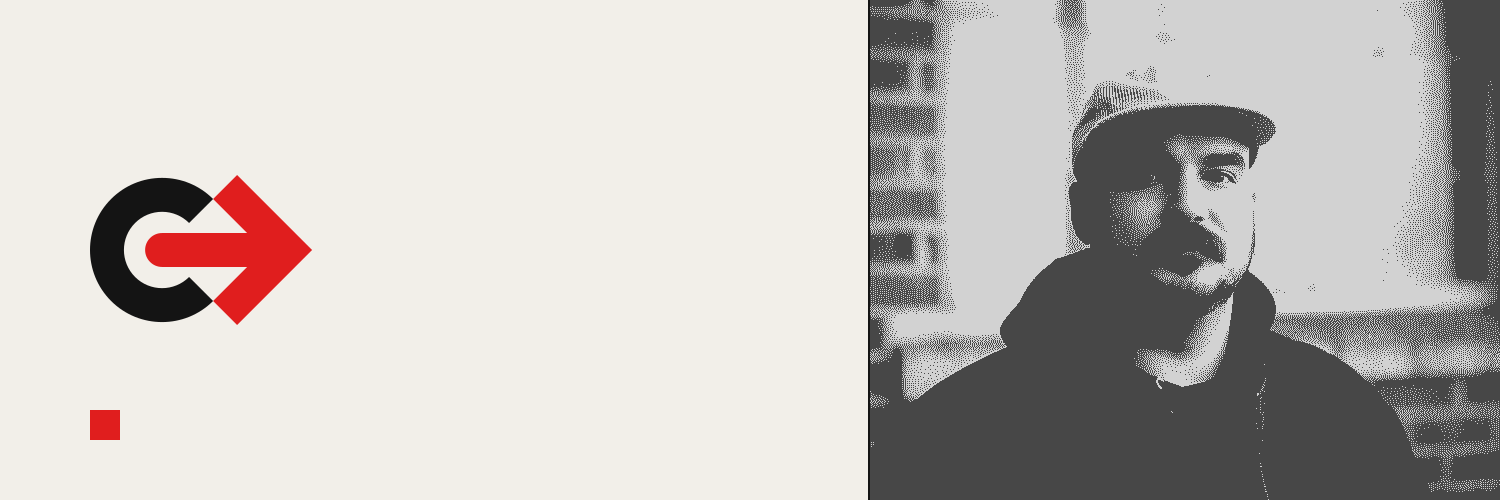
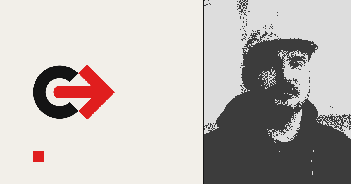
Ready to use exports live in /brand. Banners carry no text on purpose: the platforms set your name next to them, and the mark plus the dithered portrait do the talking.
- AVATAR · DITHER
800x800. Socials at large sizes.
- AVATAR · GRAY
800x800. Small sizes where dither would moire.
- BANNER · LINKEDIN
1584x396.
- BANNER · X
1500x500.
- OG CARD
1200x630. Link previews.
- LOGO SVGS
Four variants, vector, in /brand.

Letter size, printable straight from the browser so Lennon embeds correctly. Use it for cover letters and any simple print correspondence. The resume will move to this system next.